
Sea Level Predictor
In this short analysis. We will be looking at a dataset of the global average sea level change since 1880. We will then be plotting a regression line with pandas and matplotlib to look at the trajectory of how the sea level will rise until year 2050.
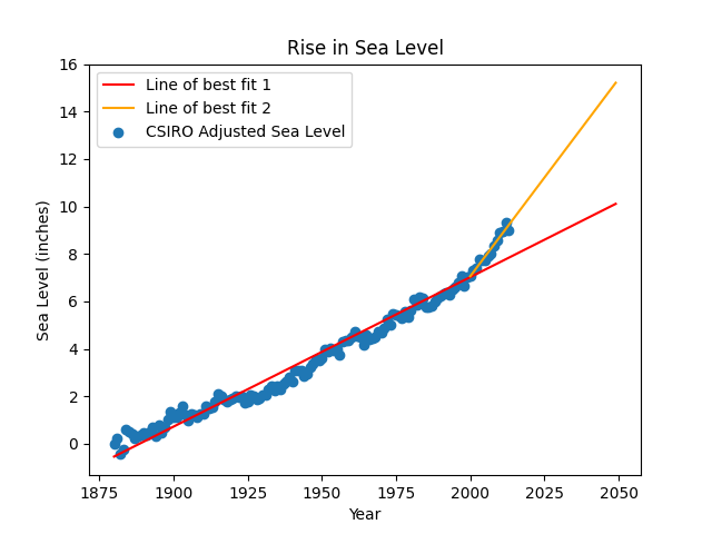
The dataset that we have consists of 134 rows and 5 columns. It starts from year 1880 and ends in year 2013.
The steps taken to do the plot is as follow:
- Read in the data from the csv file with pandas
- Plot the scatter with matplotlib
- Using linregress function from stats module under scipy library, we obtain the line of best fit and find the gradient and y-axis intercept
- We then generate additional data until year 2050 and plot the line.
- We then observe that from year 2000 onwards, the scatter seems to deviate more from the line.
- Using linregress again, we find the gradient and y-axis intercept of the line of best fit for data points from year 2000 to 2013.
- With this information, we then plot the new trajectory and generate new data for a second line to predict how much the sea level will rise to in 2050 based on this increased rate of change.
If you would like to find out more about my python code, check out the repo here
Analysis:
The main contributing factor to an increase in sea level is global warming. From the above chart, we can see that the rate of increase in the sea level has been fairly constant until the year 2000. This tells us that the rate at which we pollute the environment and trap heat has been consistently increasing. However, from the year 2000 to 2013, the rate of increase in sea level has accelerated which means that global warming has also increased. This chart tells us how important it is to ensure that future technologies we employ and energy we consume should be as green as possible or we will face the negative impacts of global warming and a rising sea level is just one of the effects.